make your next ad pop
Typography is one of the most overlooked elements in advertising—yet it has a direct impact on readability, credibility, and conversion. Whether your message is on a bench, a truck display, or a digital ad, how your text is designed often determines whether it gets noticed or ignored. Here are six typography hacks we consistently apply at Elevate Media Displays to help ads perform better in real-world conditions.
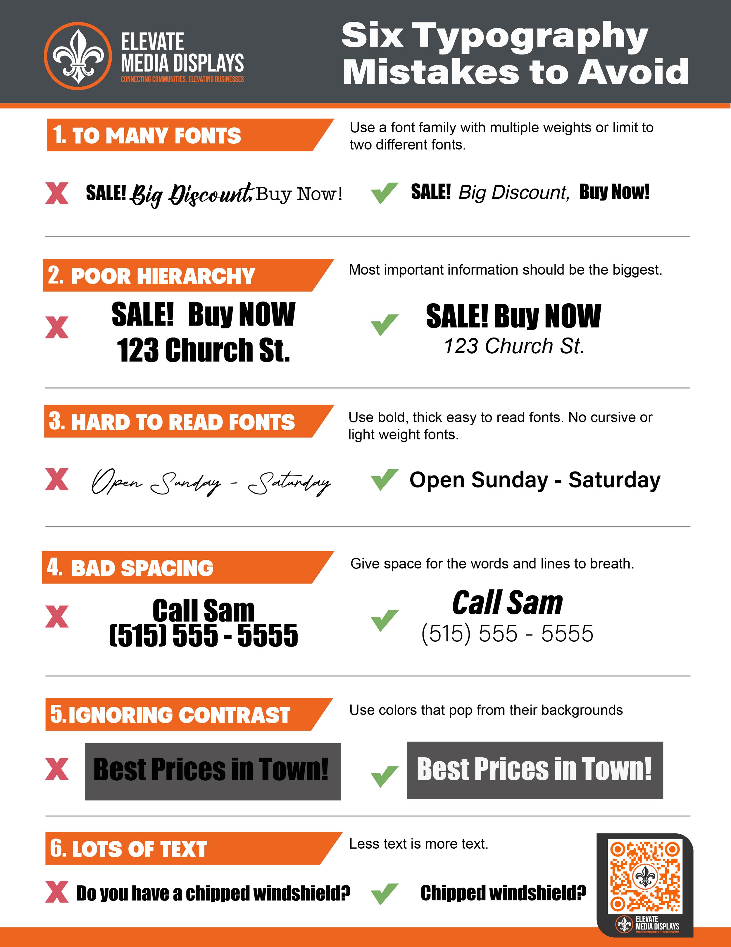
1. To Many Fonts
Using too many fonts creates confusion and visual clutter. Strong ads typically rely on one headline font and one supporting font. This keeps your message clean and your brand recognizable.
Hack: Two fonts. Three weights max.
2. Create Clear Visual Hierarchy
Your audience should instantly know what to read first. Headlines, subheads, and body text must feel intentionally different in size and weight.
Hack: If everything looks important, nothing is.
3. Prioritize Readability Over Style
Decorative or script fonts may look interesting, but they fail at distance—especially outdoors or on moving displays.
Hack: Clean, bold fonts win every time in advertising.
4. Fix Your Line Spacing
Text that’s too tight feels cramped; too loose feels disconnected. Proper line spacing dramatically improves comfort and clarity.
Hack: Body text should breathe. White space is part of the design.
5. Use Strong Contrast
Low-contrast text disappears, particularly in sunlight or on busy backgrounds. Contrast is more important than color choice.
Hack: Dark text on light backgrounds (or the reverse) always performs better.
6. less is more
Remove unnecessary text that clutters up your message.
Hack: Your message needs to solve a particular customer problem.
Contact us today to begin your exclusive advertising journey.
download the typography hack guide:
Click the Download button below to access the Typography Hack Guide.
typography hACKS