Color Wheel
Choosing colors shouldn’t feel overwhelming. Whether you’re designing a website, building a brand, or creating social graphics, understanding basic color harmony can save time and improve clarity. That’s why I created this friendly Color Wheel Cheat Sheet—a quick visual reference you can use anywhere.
Why a Color Wheel Still Matters
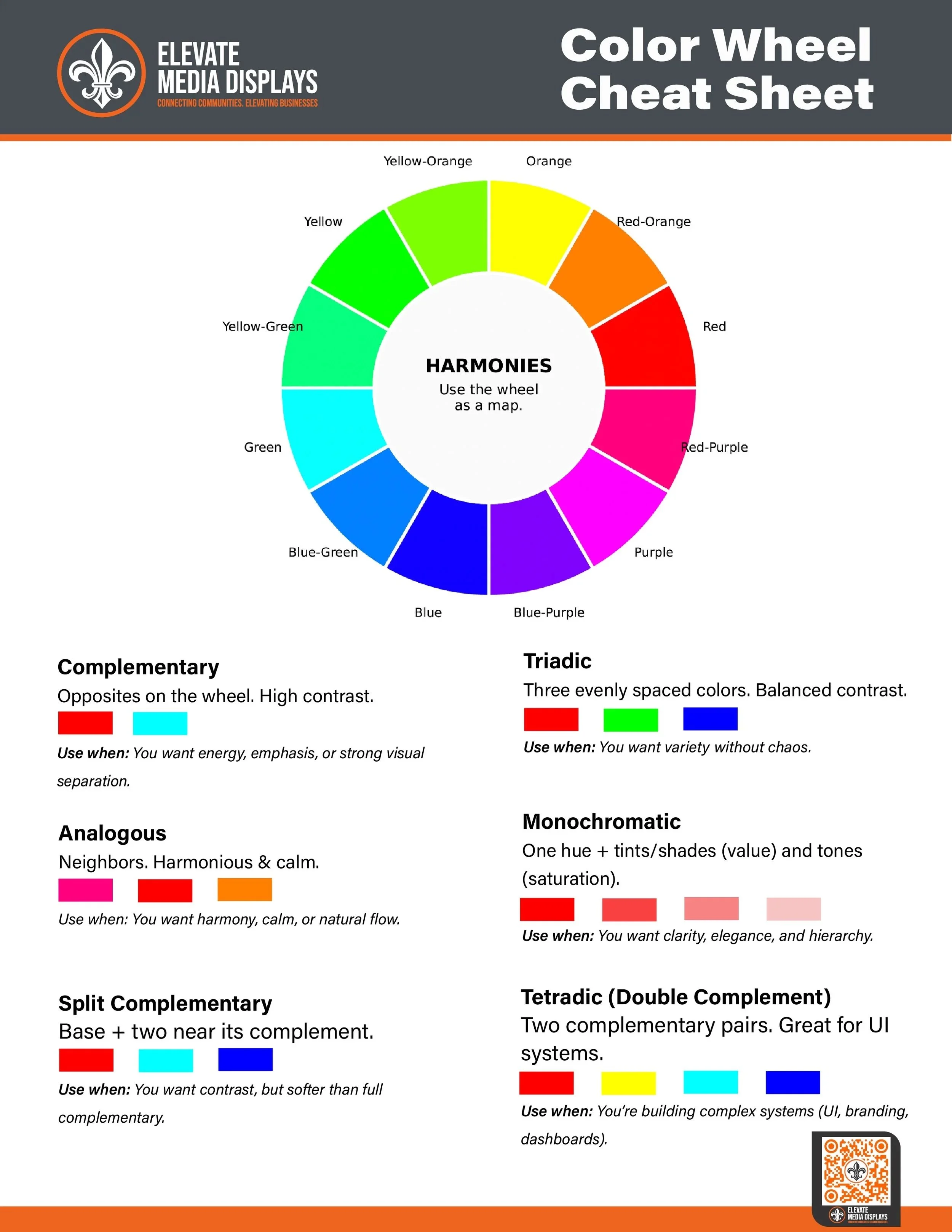
The color wheel is one of the most useful tools in design. It shows how colors relate to each other and helps you choose combinations that feel intentional rather than accidental. Instead of guessing, you can follow proven harmony rules to create balance, contrast, or emphasis.
What This Cheat Sheet Covers
This vertical version is designed specifically for phones and small screens. It stacks everything in a clear, scroll-friendly layout:
Complementary – Opposite colors for maximum contrast and impact
Analogous – Neighboring colors for smooth, cohesive designs
Triadic – Three evenly spaced colors for balanced variety
Split Complementary – Strong contrast with a softer feel
Tetradic – Two complementary pairs for complex systems
Monochromatic – One color with varied brightness and saturation
Each harmony includes simple swatches and examples so you can apply the concept immediately.
How to Use It
Pick a base color.
Choose a harmony rule.
Adjust brightness and saturation to create hierarchy and improve readability.
This approach works for logos, UI design, presentations, social media graphics, and print layouts.
Designed for Real-World Use
If you’re looking for a fast way to make better color decisions, this cheat sheet gives you the fundamentals at a glance.